The Brief
Cordialis Press is personal project that I branded and designed a website for. We wanted to create a brand that housed a variety of styles of invite templates and worked well on social media. We decided that the brand should have a style that was classic but contemporary, use colour and be simple yet eye catching.
Process
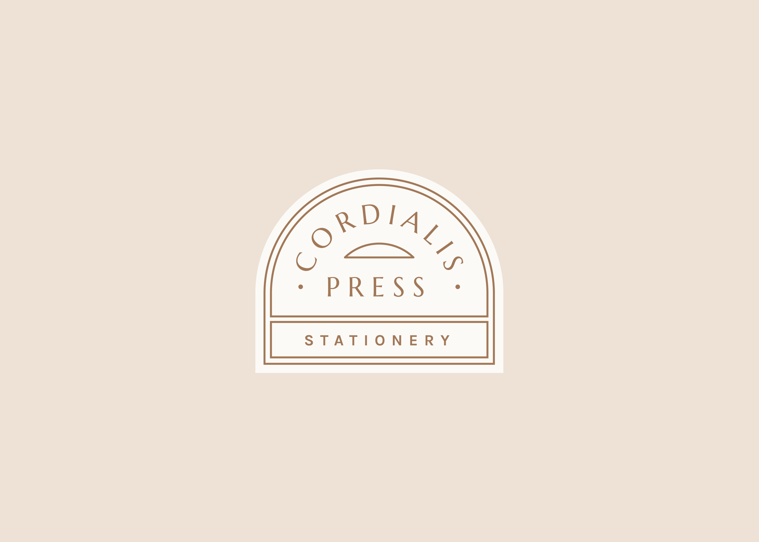
I decided to use a stamped style motif logo to create a classic stationery look, this works with a larger illustrated logo and a smaller monogram. The font is a demi-serif, tying the classic with contemporary. Colours were chosen to go against typical wedding stationery colours, and hoping to be being more inclusive and keeping the brand open to other types of event stationery.
Application and Outcome
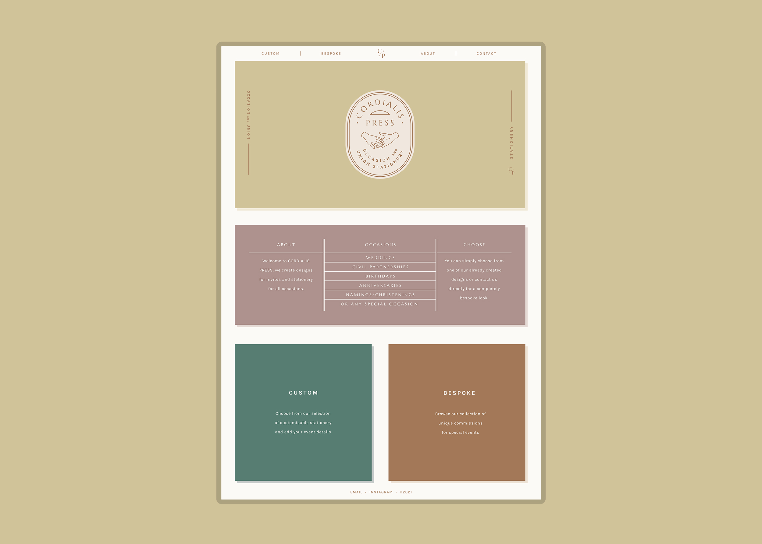
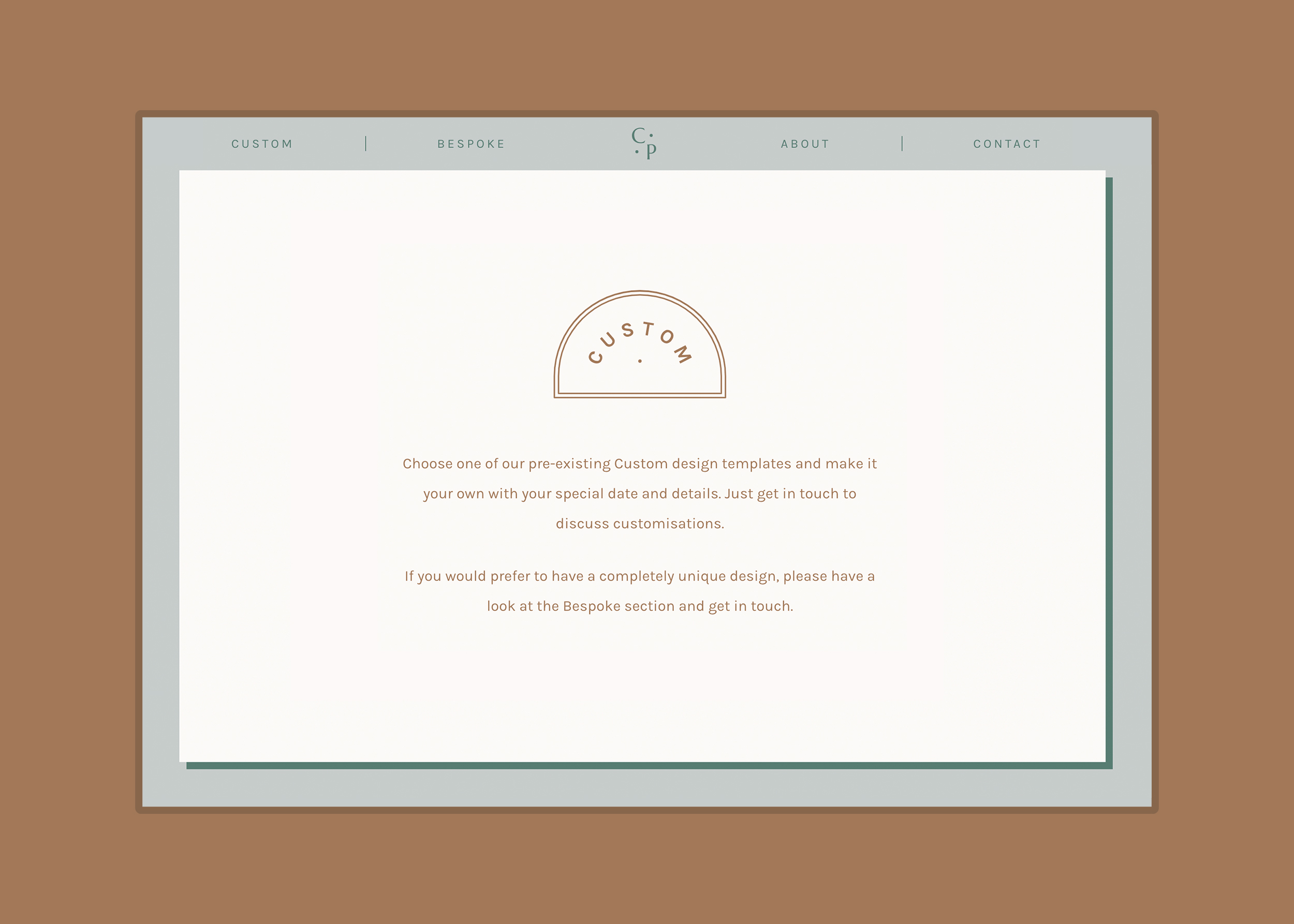
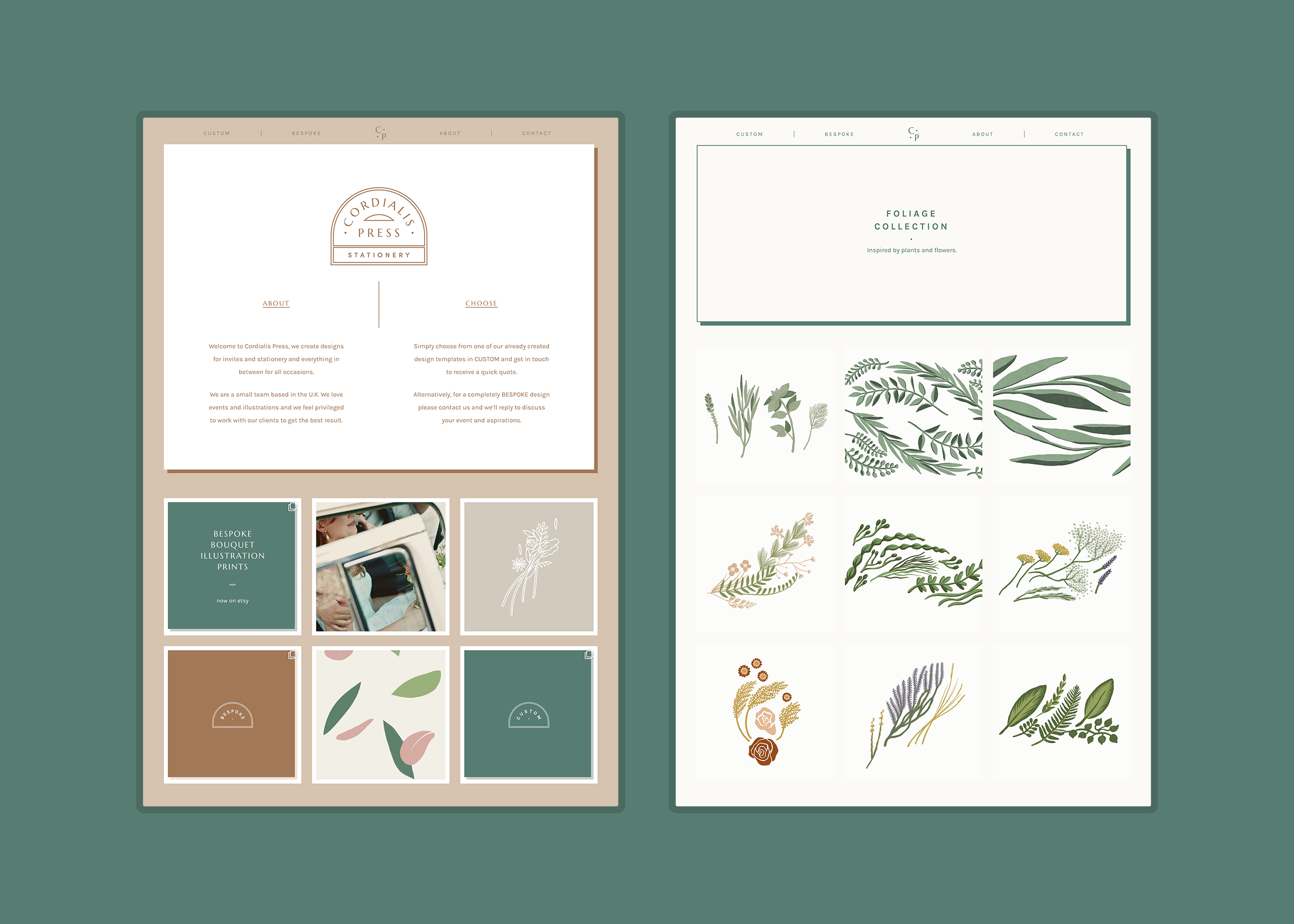
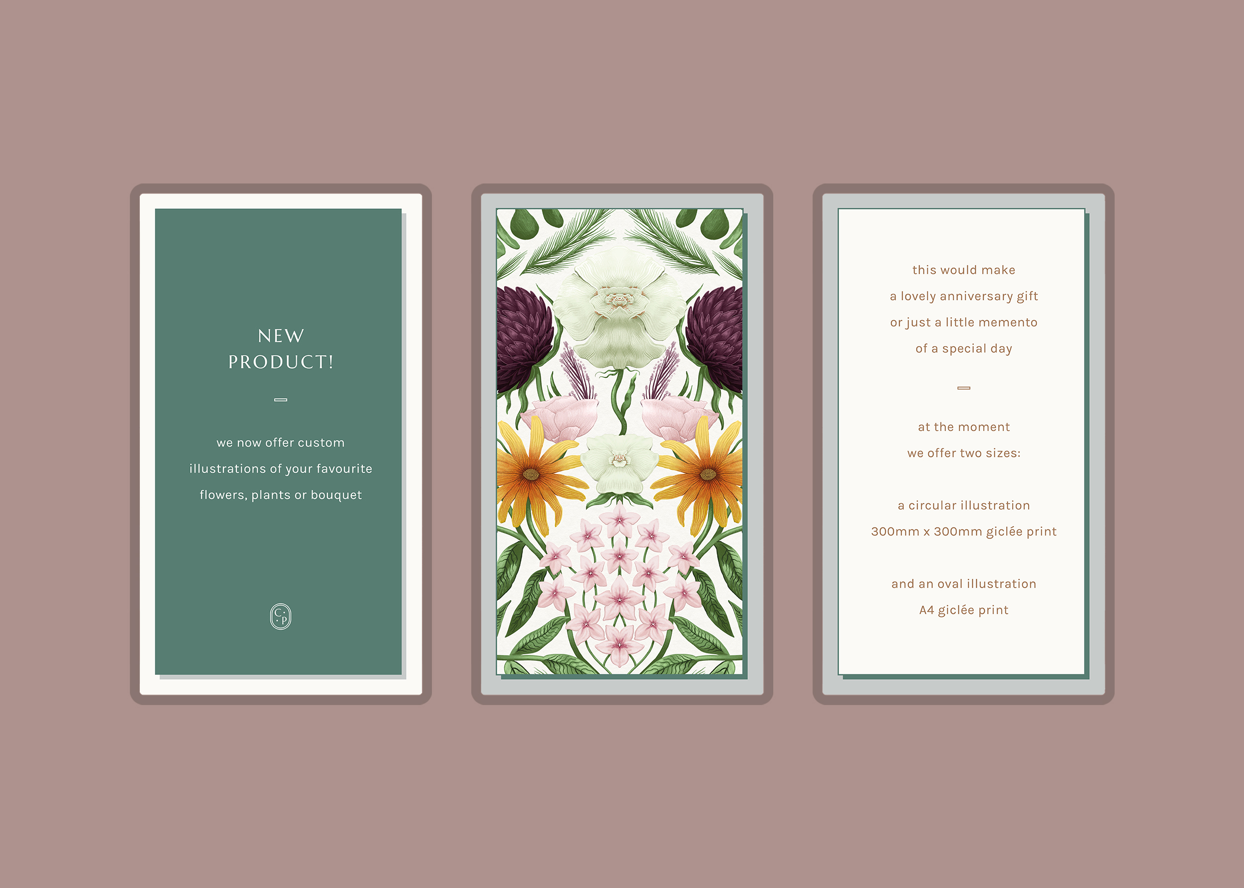
The branding carried on to the website where I used rectangular invite-like blocks to create a layout and theme. Colour was applied across these blocks and within each section to distinguish categories. This style could also be used on Instagram and other social media too.
